Som KF-medlem får du eksponering på Kreativt Forum og i vår byråguide, faglig inspirasjon og sosialt påfyll, i tillegg til praktisk informasjon om juridiske avtaler og bransjestandarder.
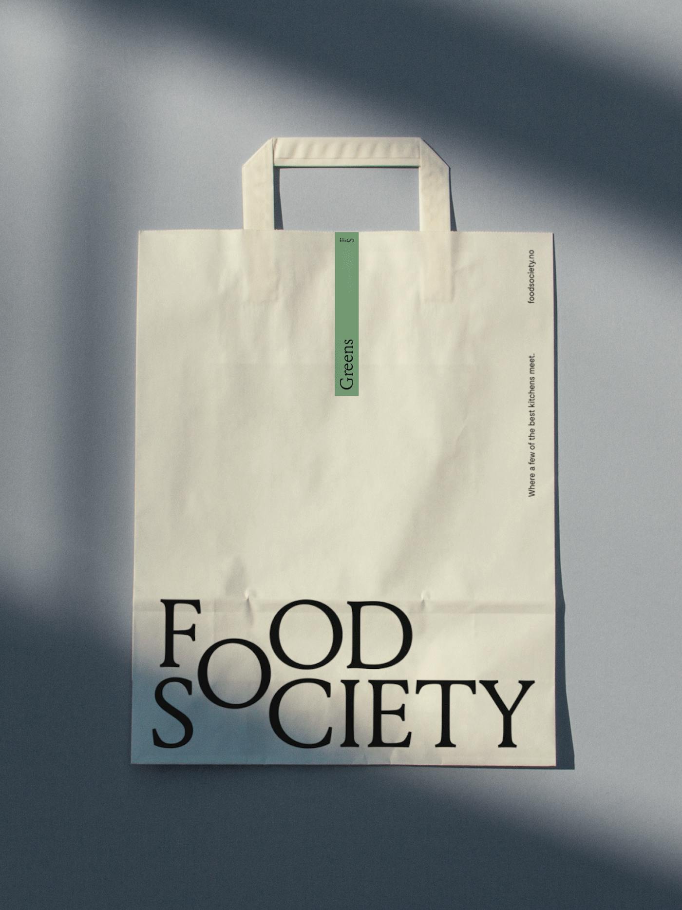
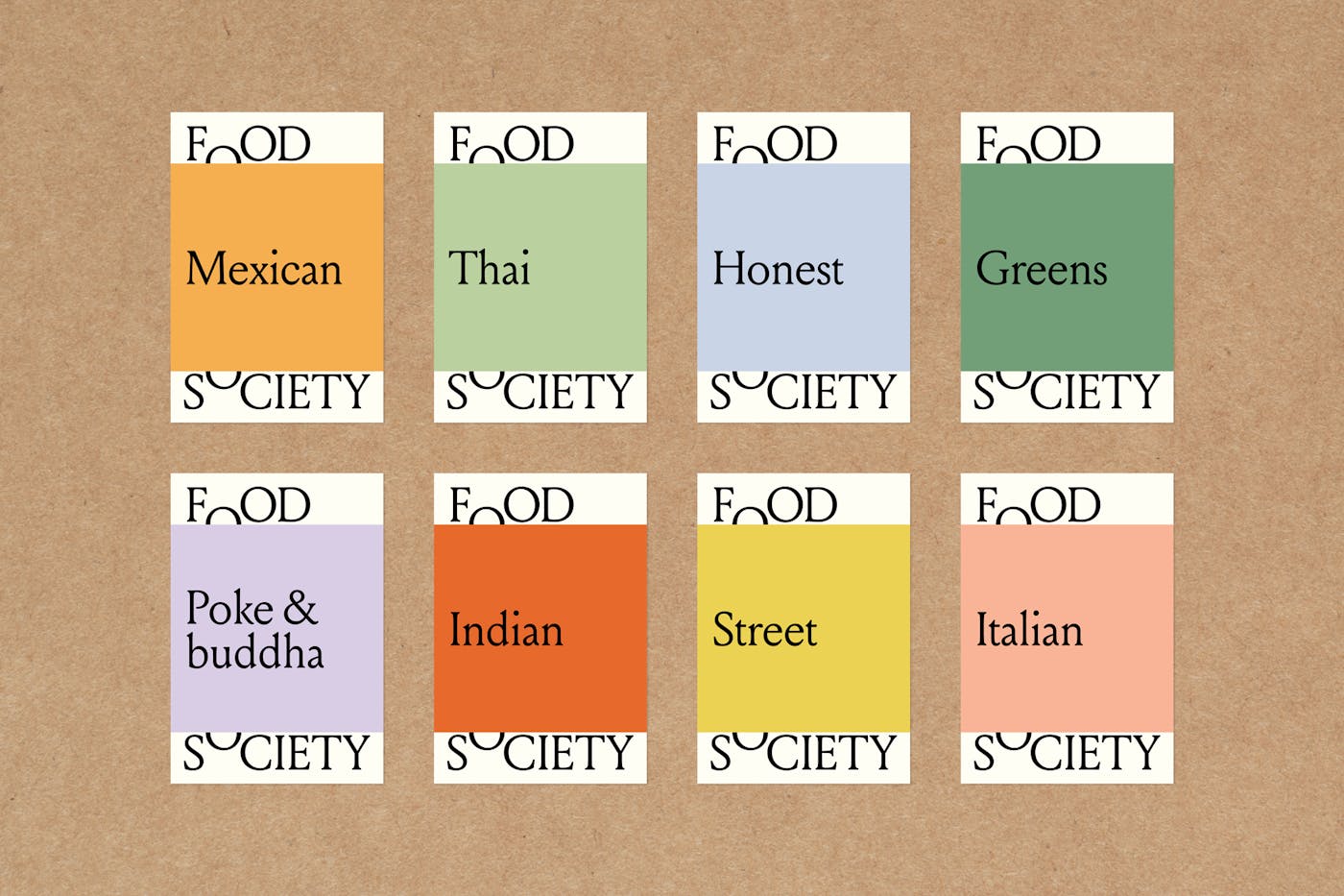
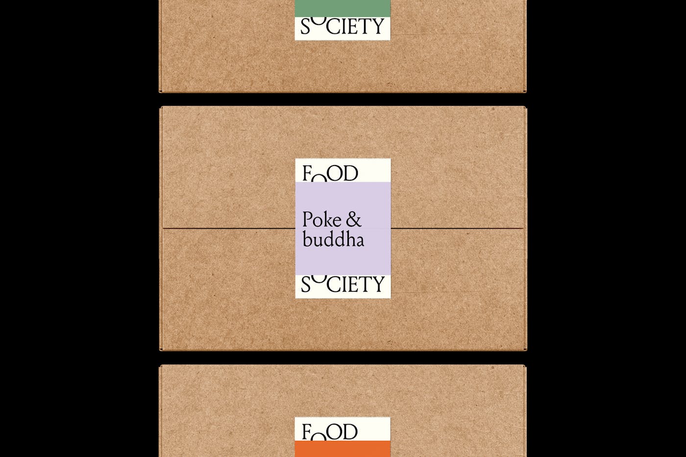
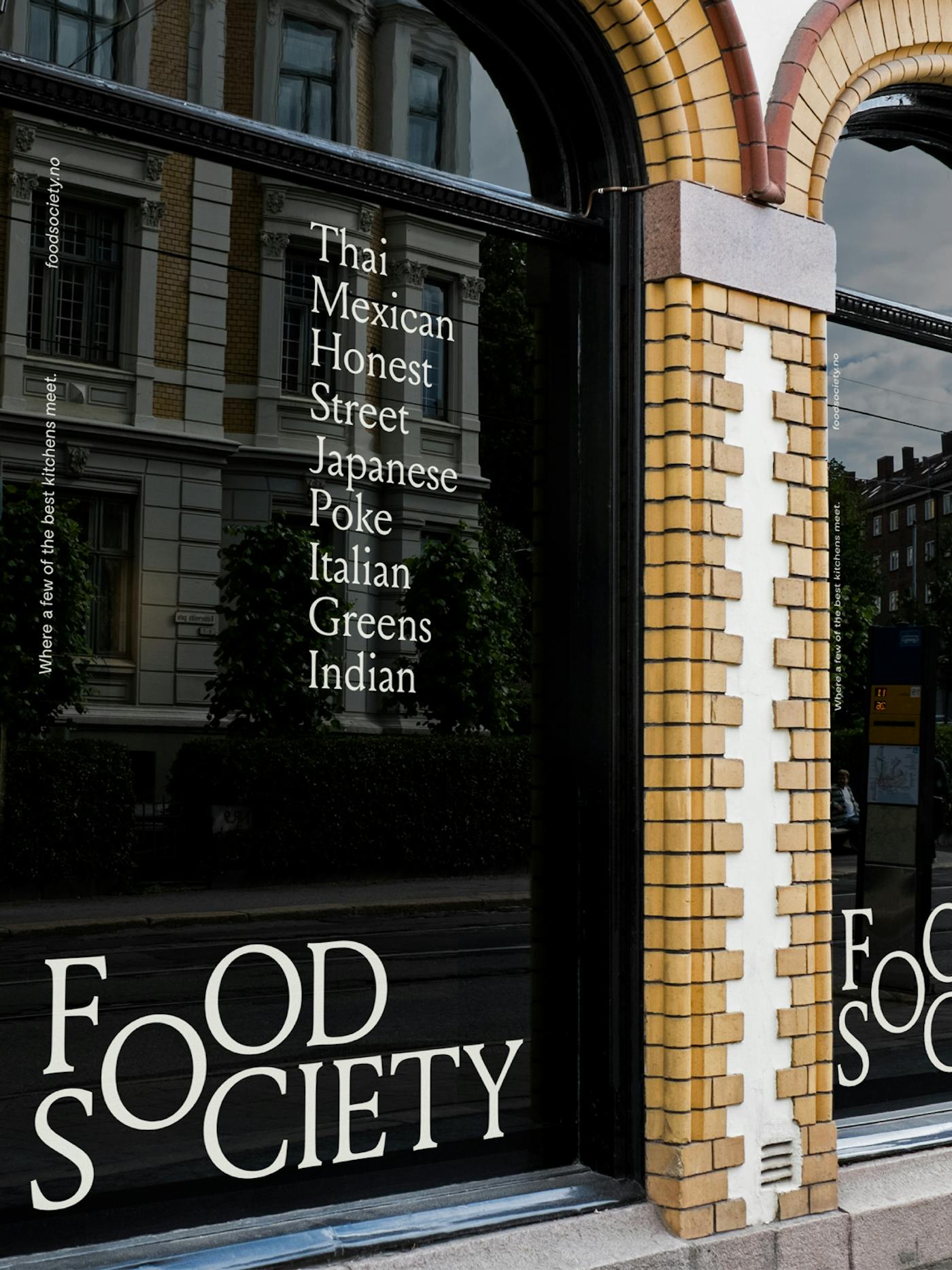
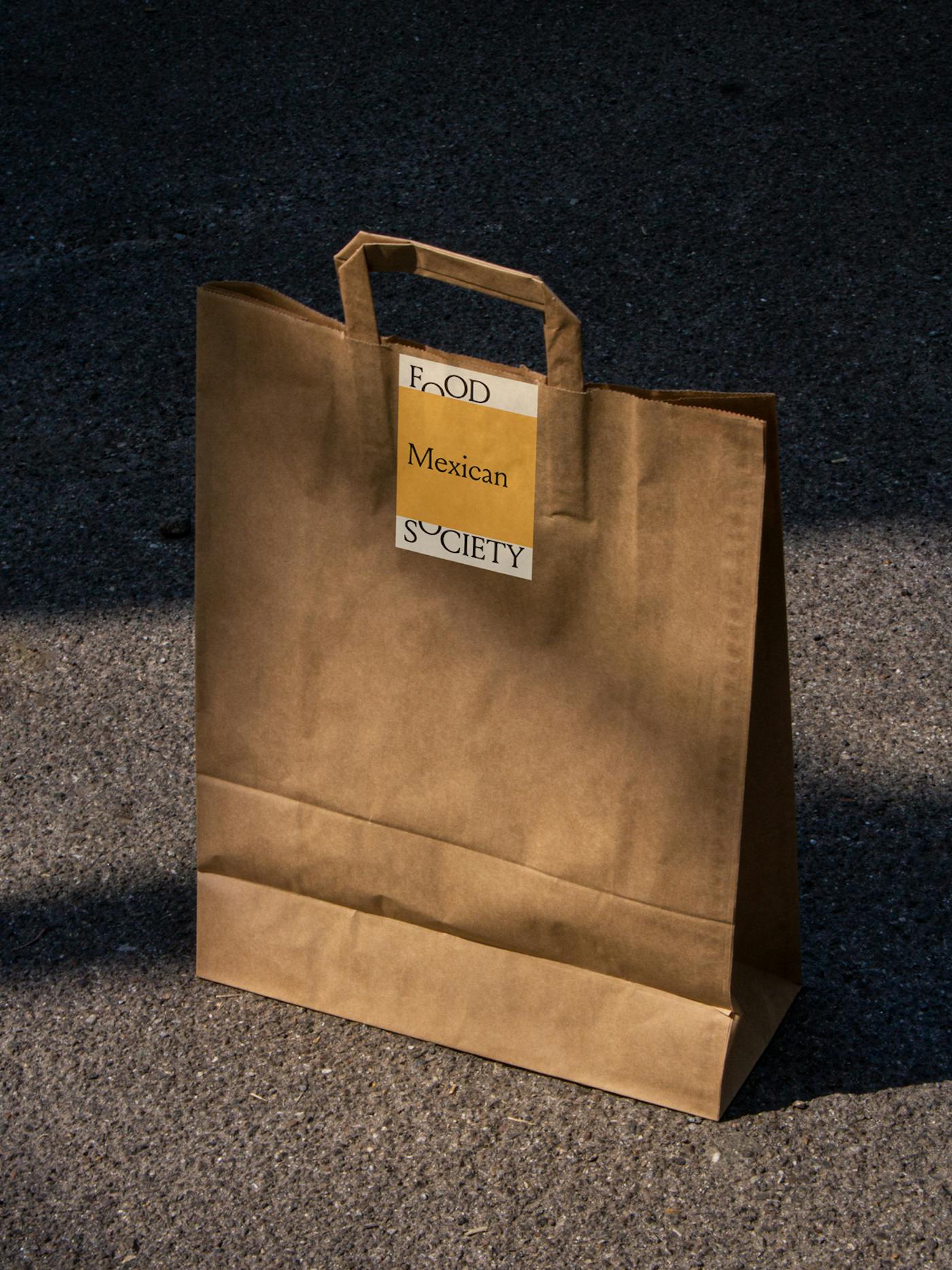
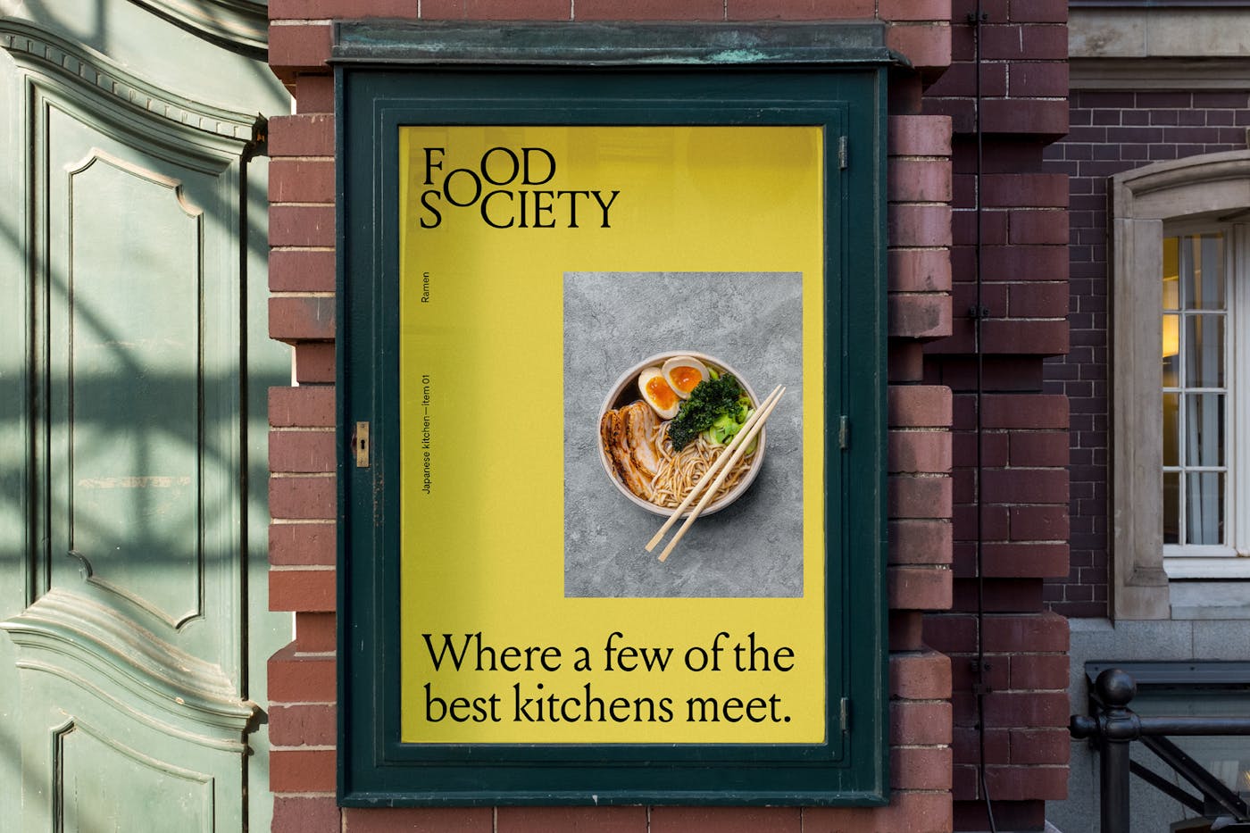
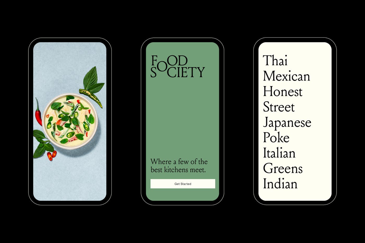
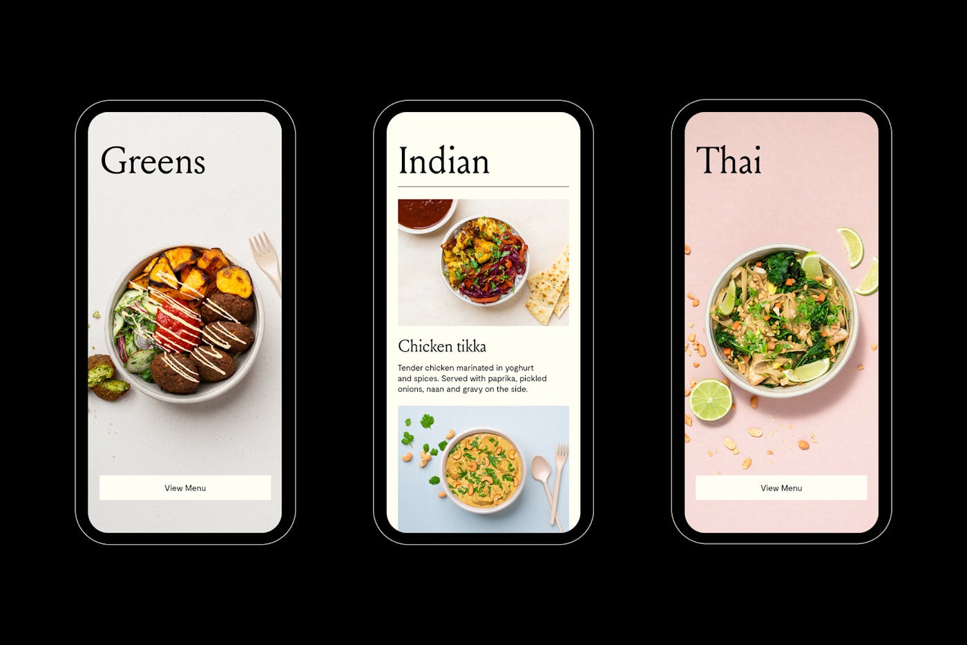
Following several launches in a variety of consumer-facing industries, Askeladden & Co moved into the food world with a one-stop takeaway shop. Whereas many chefs specialise in one cuisine, Food Society sees the world as their playground, uniting some of the world's best kitchens by exploring a wider array of flavours.
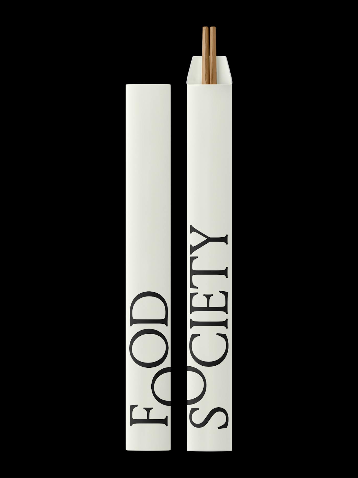
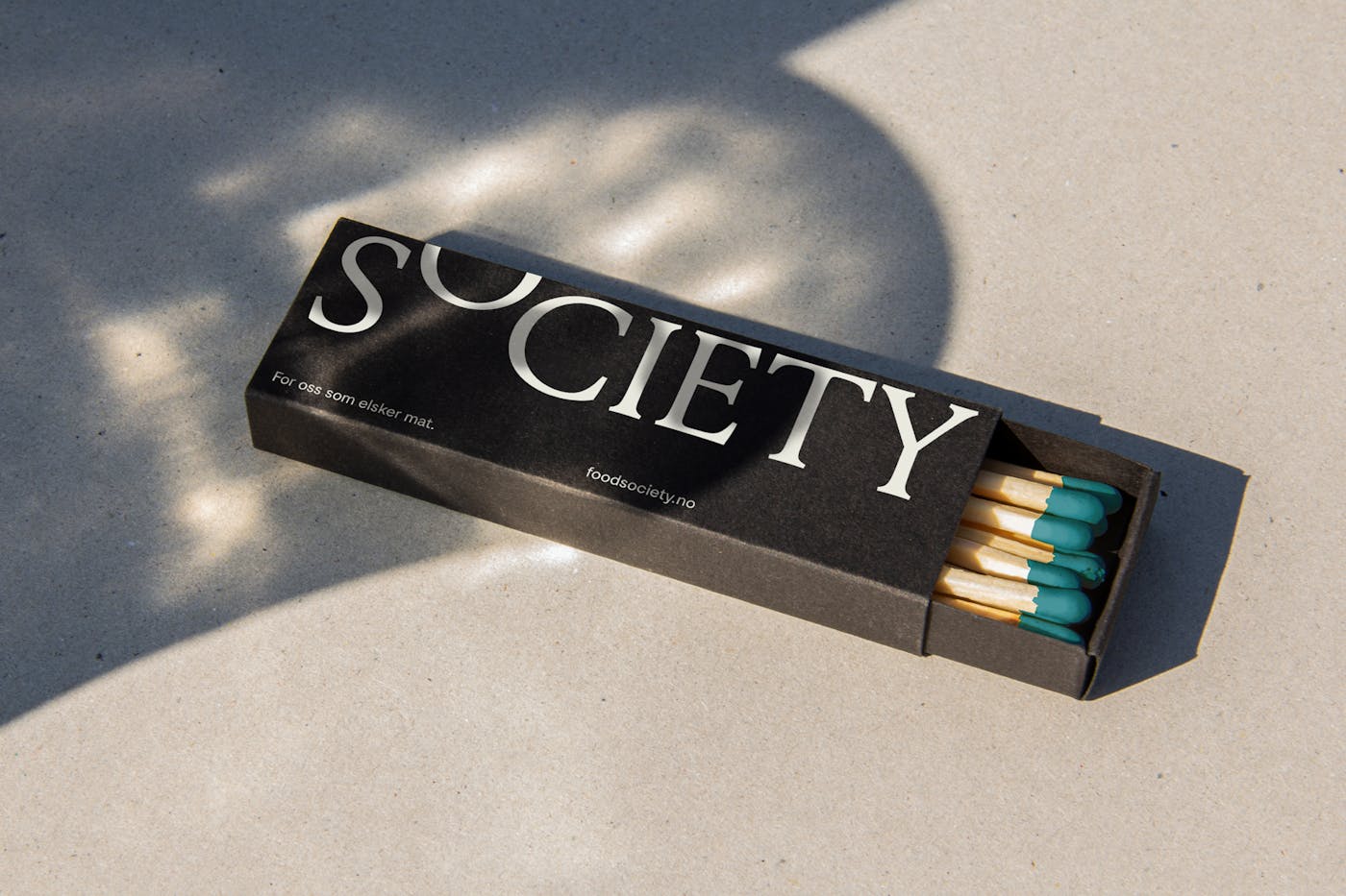
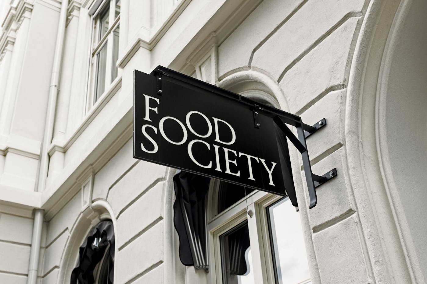
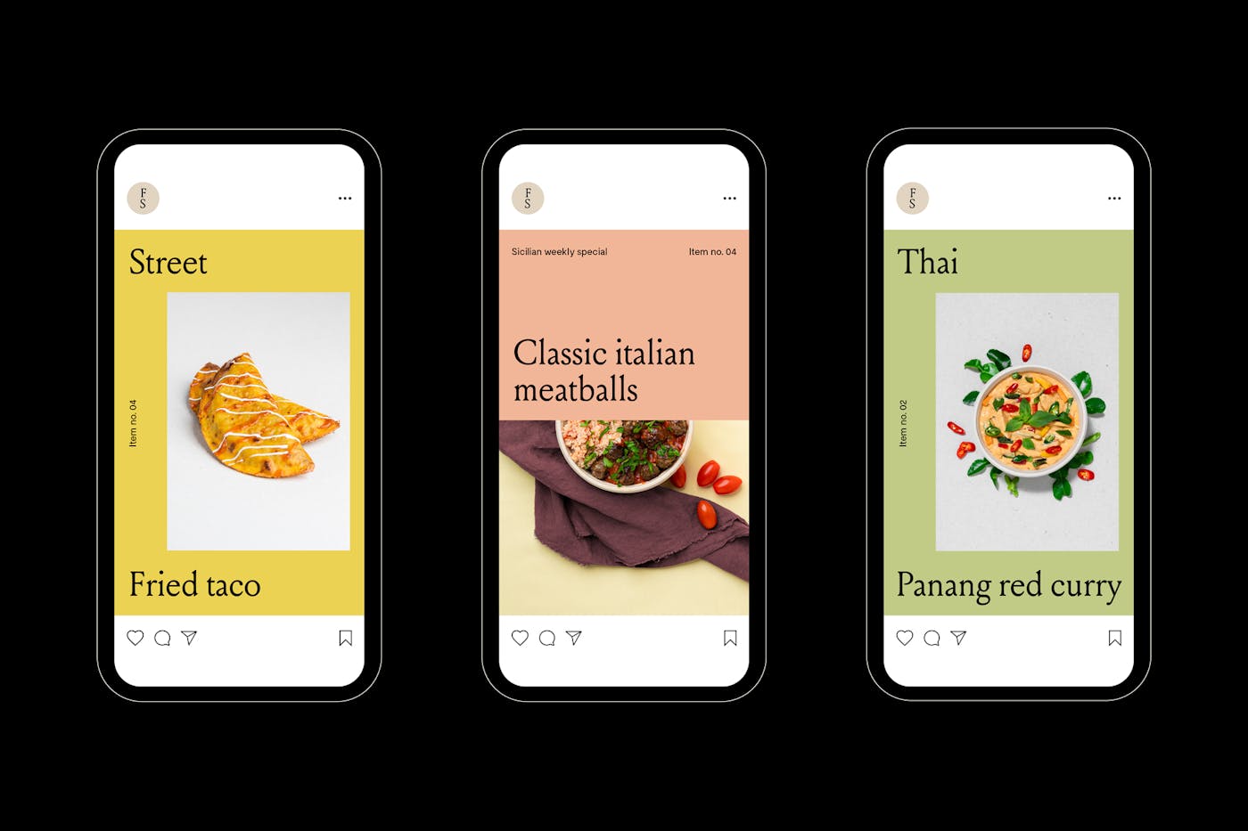
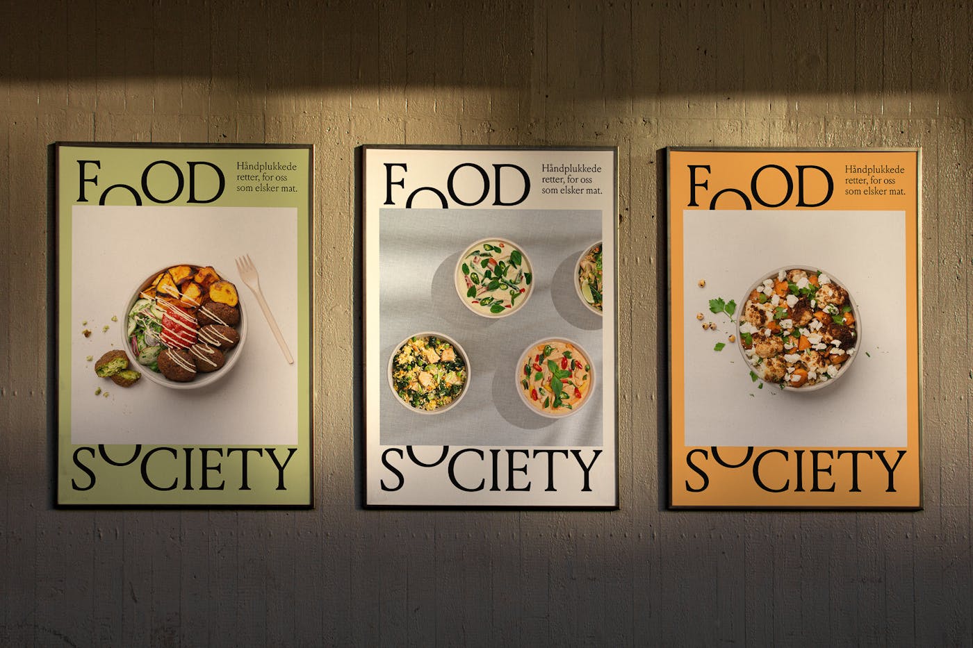
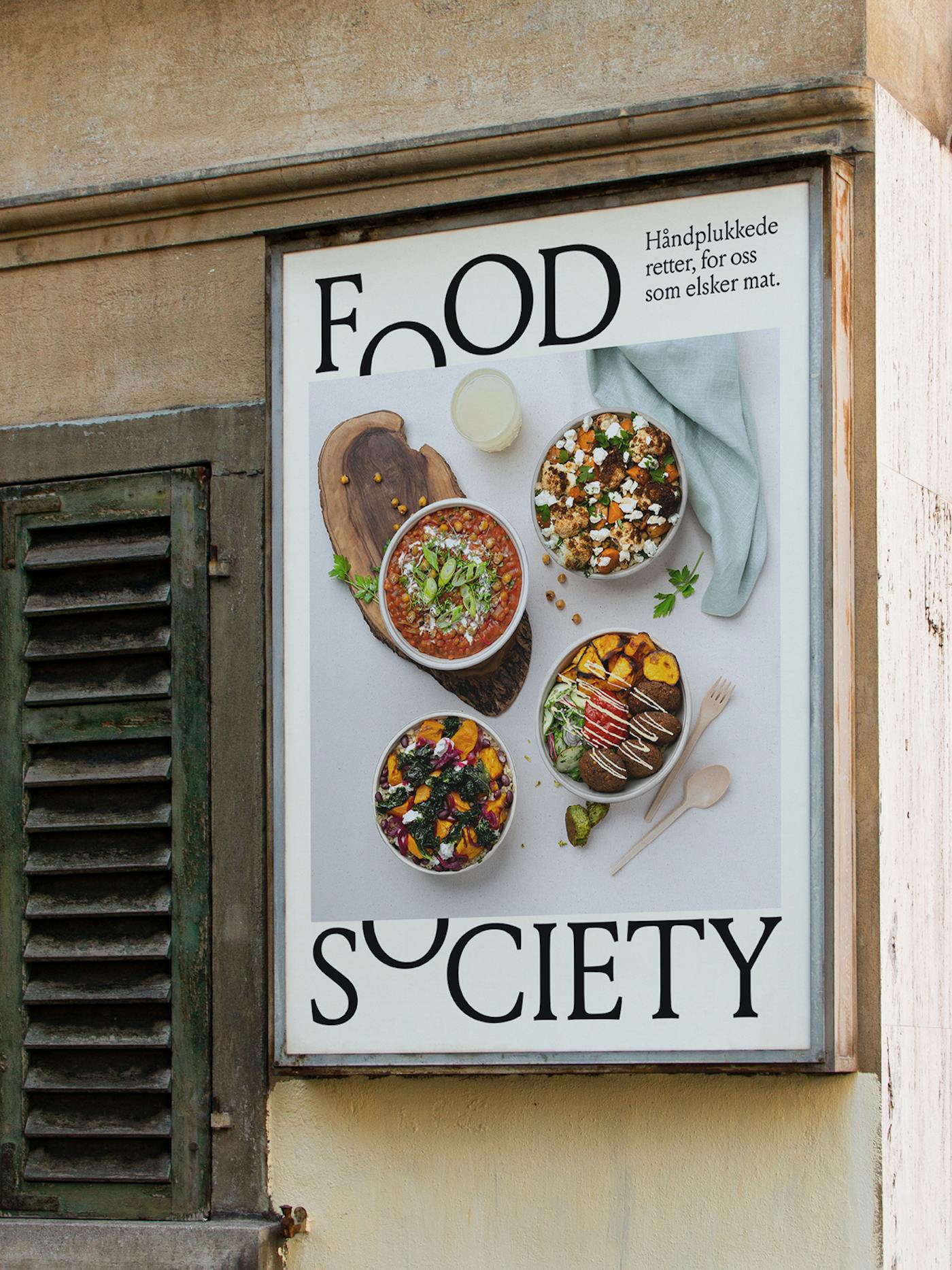
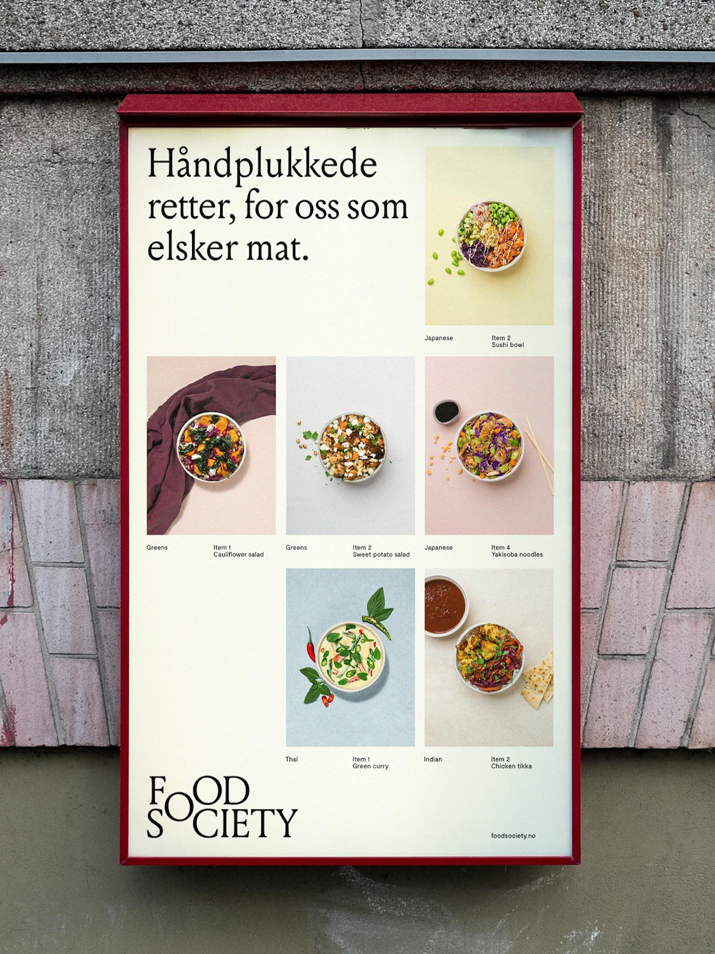
The identity embodies the idea of community, using the shared ’O’ to represent the point where the different kitchens come together. As the focal point of the identity, the ’O’ is consistently used as a key visual gesture across the different applications and has the flexibility to open up, allowing the different cuisines to live within the main brand. The core palette is composed of subdued colours, enabling each kitchen to take on differentiated and vivid tonalities. The soft and rounded forms of the typography bring an appetising quality to the communications, expressing a sense of warmth. As each ingredient and dish are carefully selected, the product photography focuses on the curation aspect of the brand. Images are clean; simply putting the emphasis on the dish as the central element of the images.