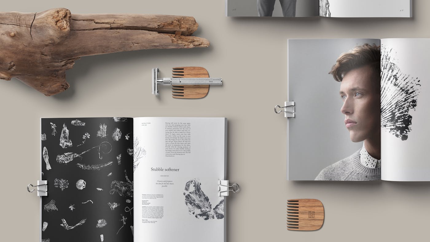
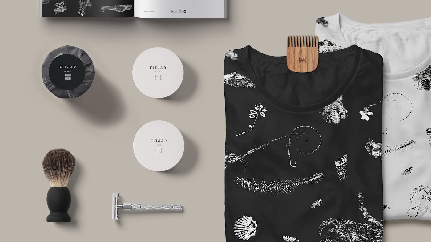

It comes down to time immersed in process; a wet shave – the old laboursome way; lowering our pace; freezing a moment in time; allowing contemplation and inspiration to again enter our consciousness – valuing the transition between the old and the new.
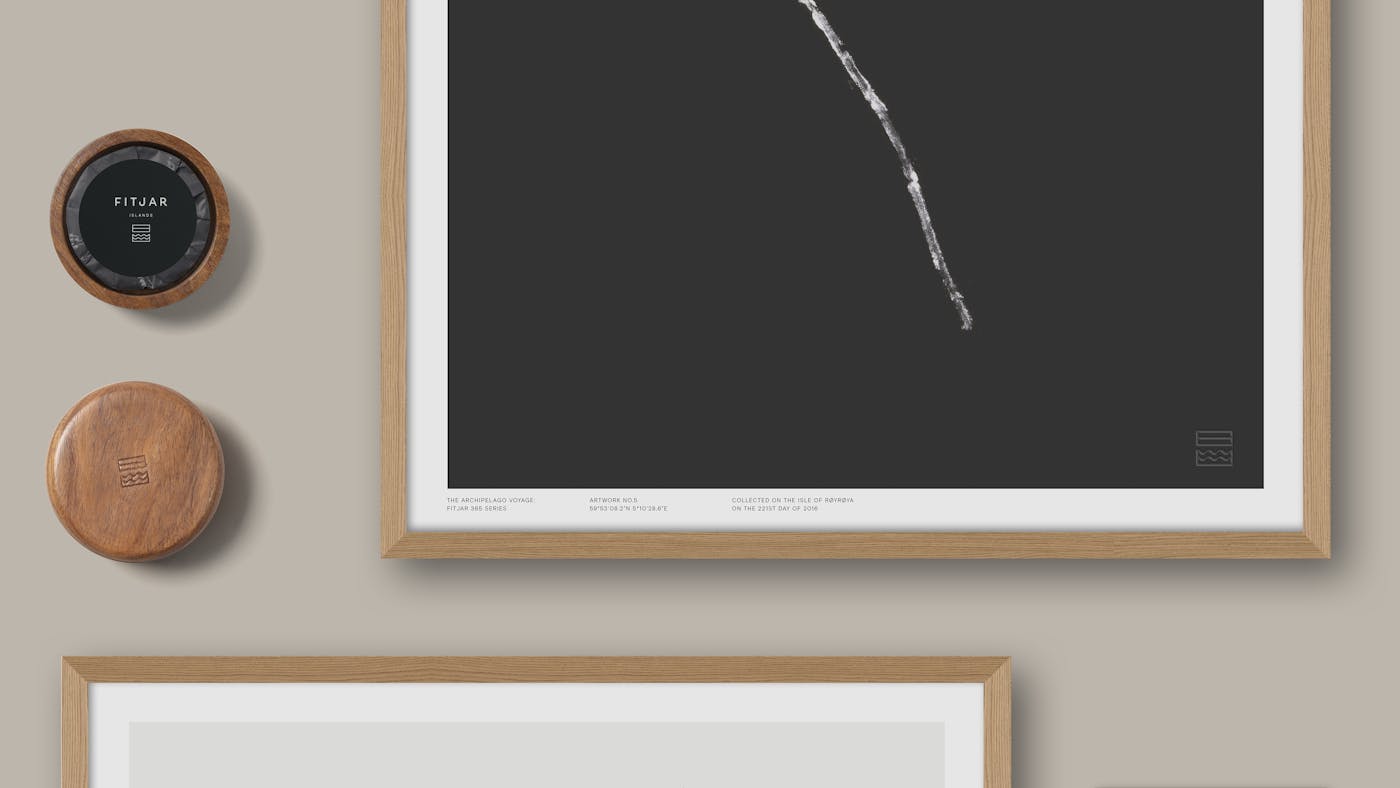
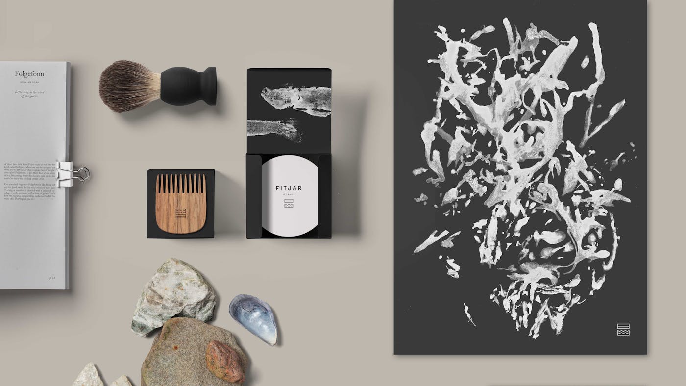
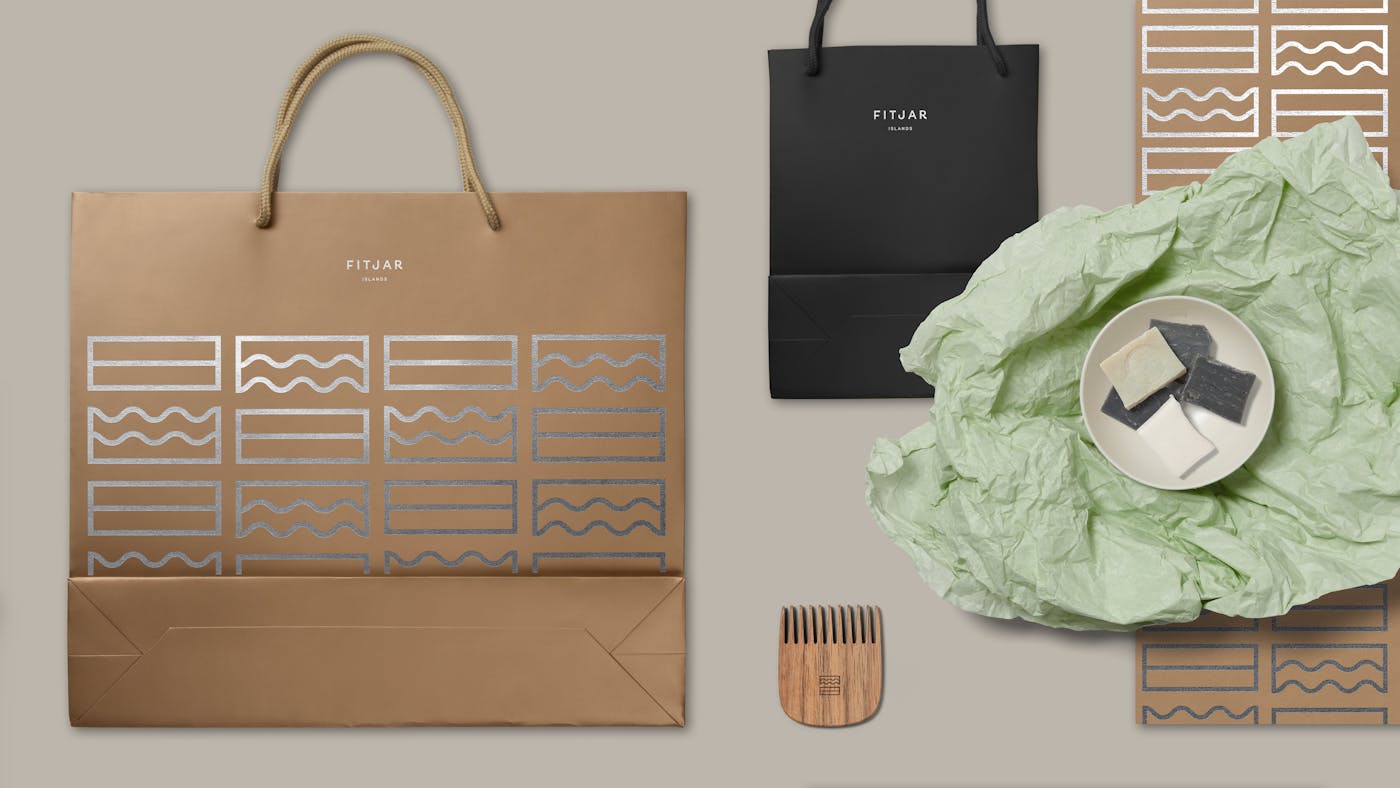
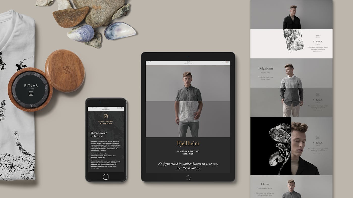
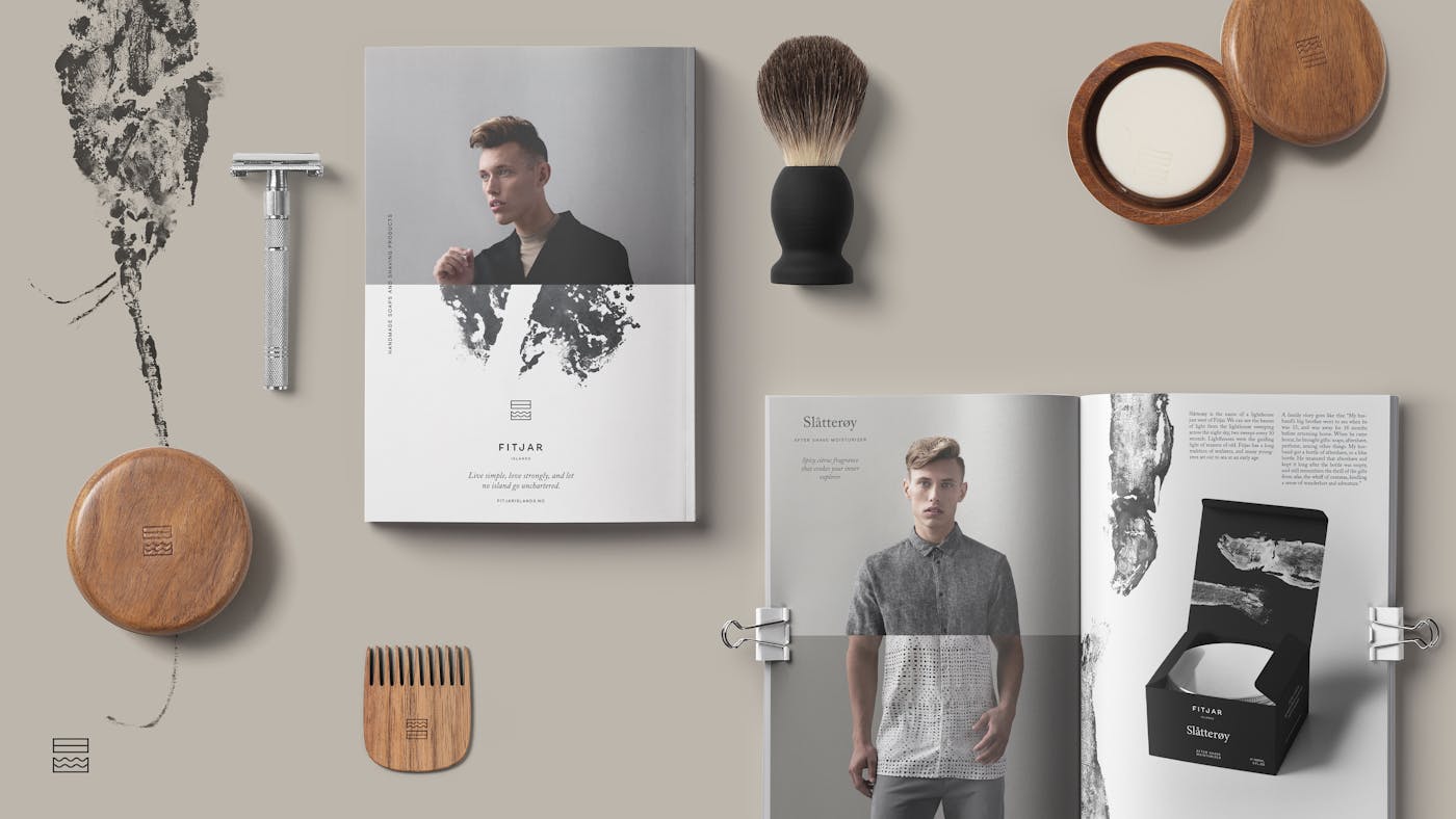
Balance is the key communication in this identity. Balance between nature and the man made, between before and after. Balance cannot exist before all parts are equal, defining the line in the centre; the “crop”. The logo is founded on this principle of balance, followed through to layout and composition principles.
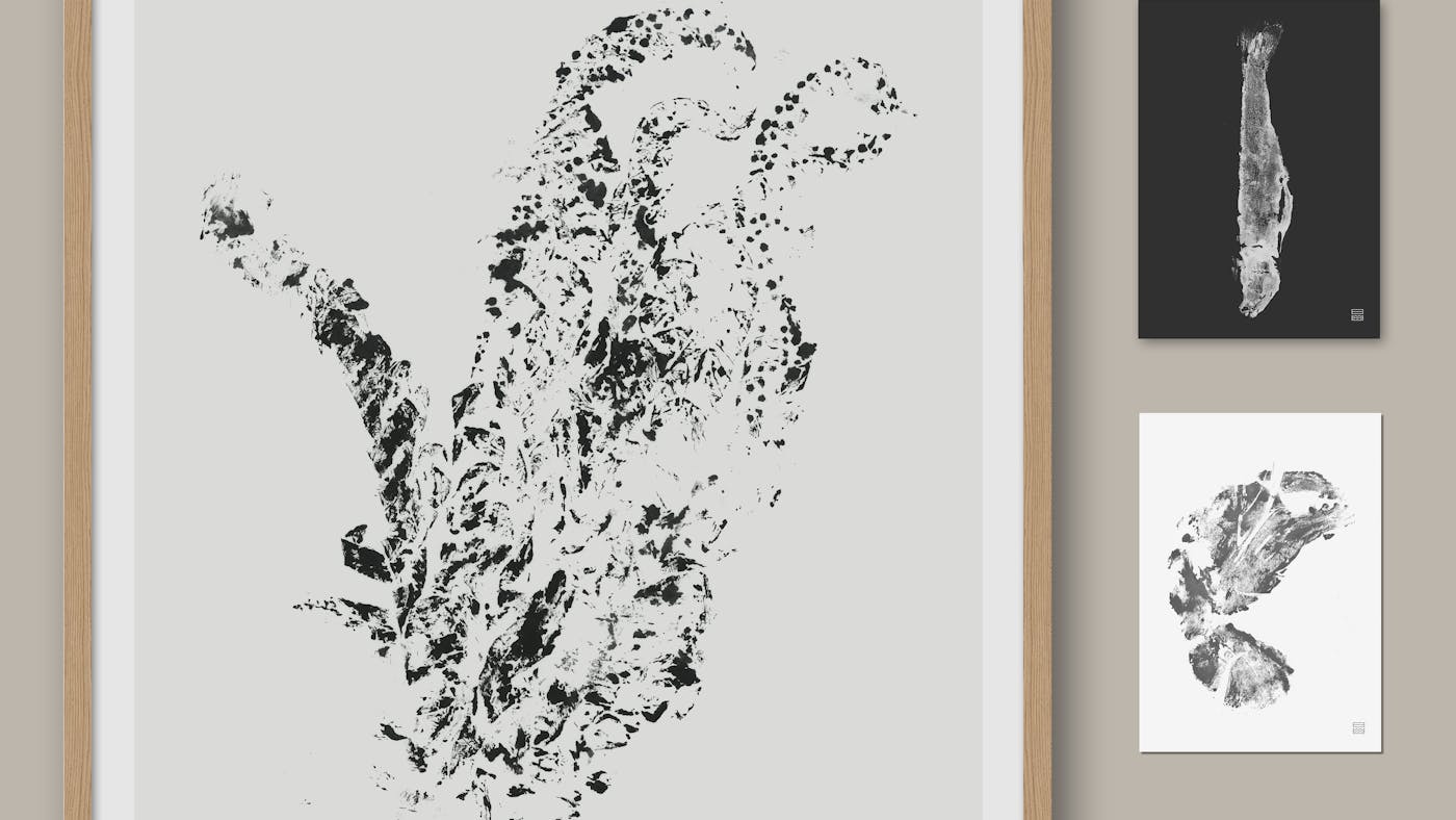
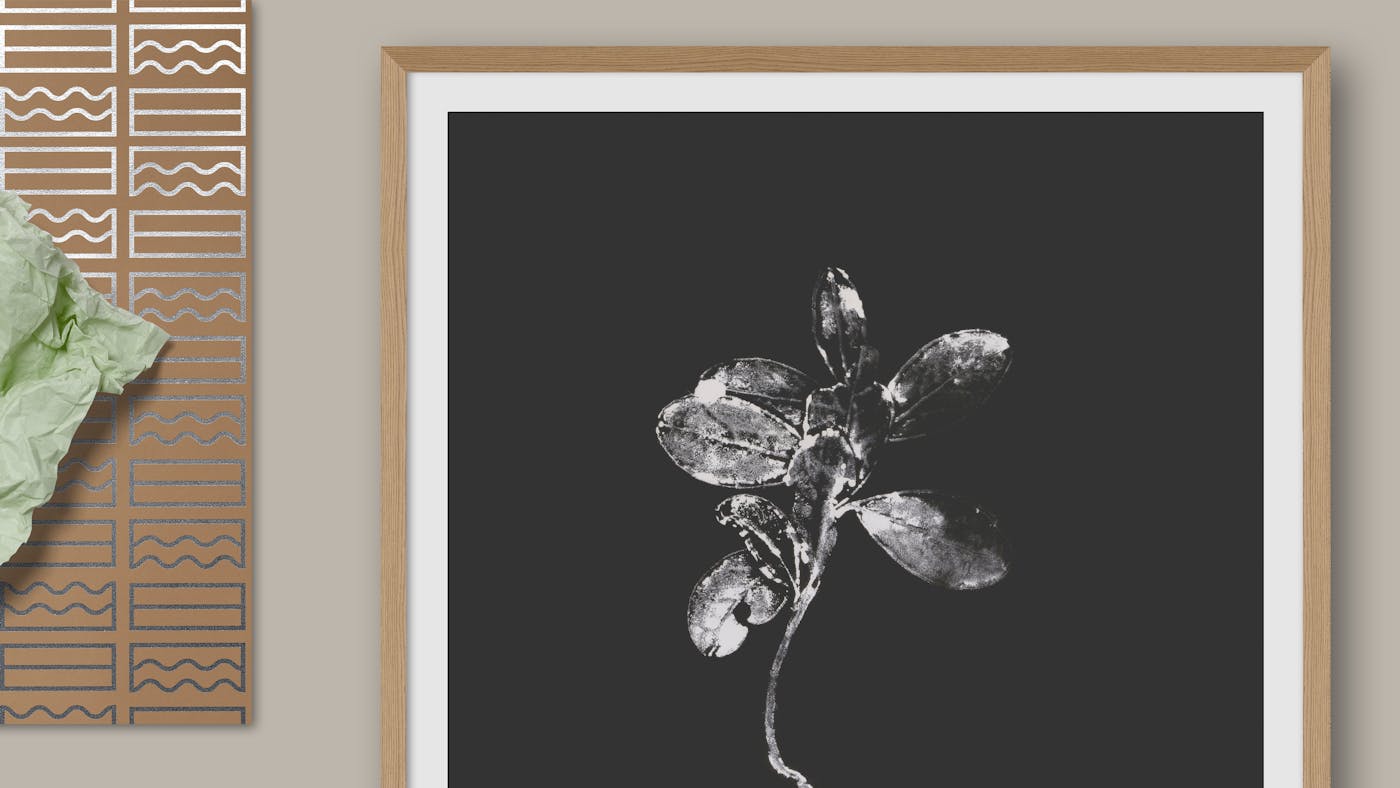
Incorporating an old fish printing technique we lovered our pace of working, immersed ourselves in the moment – allowing nature to inform the outcome.
The brand invites you to slow down – not to strive for perfection or efficiency – but to reconnect with nature and your inner self.
Involverte byråer

ANTI
Utmerkelser
-
Gullblyanten 2016 Identitet


